Laying out your scribe - VideoScribe Legacy
Planning how you layout your scribe allows you to make the most of your canvas space, and makes it easier for your audience to follow your final video
Please note: VideoScribe Legacy is the older version of our software. We continue to support it, but we recommend switching to the latest version to enjoy the best features and performance.
Click here to read the article on Accessing the latest version of VideoScribe.
Top tip: Check out our blog post on choosing the right layout for your video
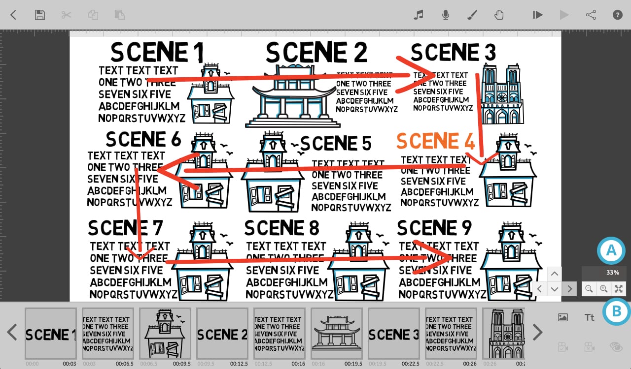
If you already know how to set cameras to create scenes, here are some tips for laying out your scribe in a way that uses the space on the canvas as efficiently as possible. A good layout is to work from the top left and work right, then go down and work left, and down again and work right, and so on, so that you have lines of elements or scenes flowing left to right, right to left and top to bottom.
Before you get started, it’s a good idea to do a quick plan to decide how many camera views will be in your scribe. Longer scribes, with more than eight camera views, will benefit more from laying out your scribe efficiently
As you can see in the screenshot below, when your elements or scenes are arranged in this way there is very little empty canvas space visible when the camera is zoomed out to fit everything in view. Also notice that the camera is currently at 33% zoom (A) when all elements on the canvas are visible.
The camera moves in the direction of the red arrows when moving from scene to scene.
This screenshot is taken when the camera is zoomed out to fit all elements on the canvas in view, which can be done by clicking on the icon marked (B).

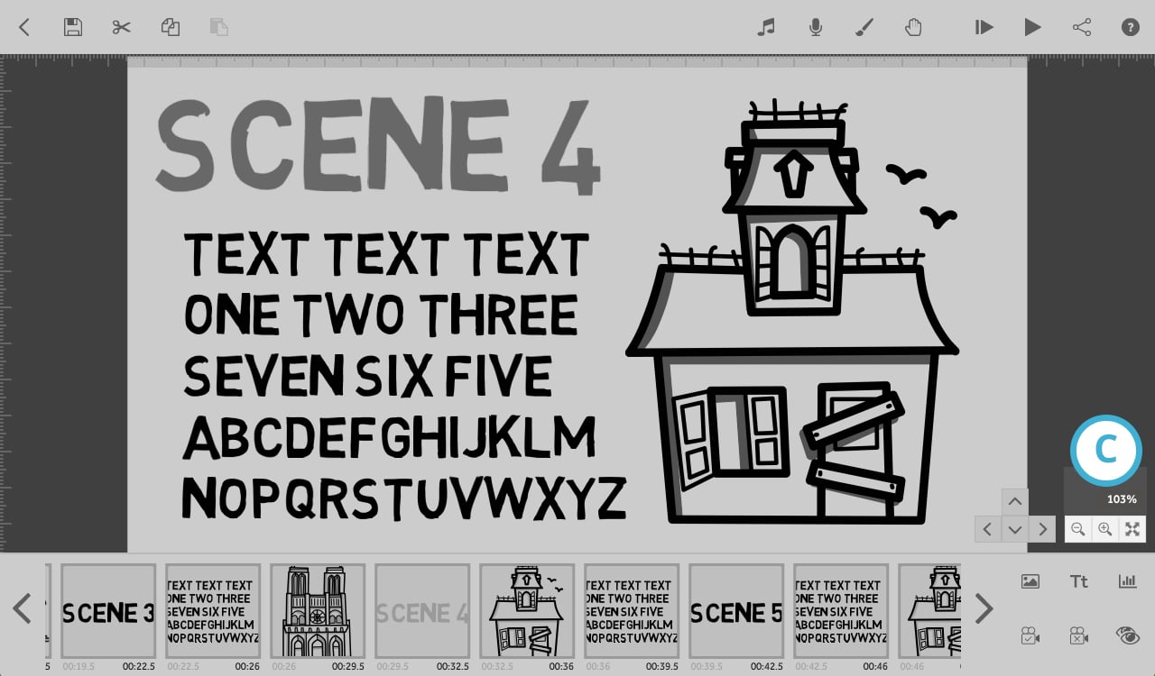
Below is a screenshot of ‘scene 4’ with the camera looking at the position that is set for those elements. Notice that the camera zoom level is at 100% (C) - the zoom level for each scene in the scribe is set to 100%. Even though the scenes are tightly bunched together you cannot see anything from another scene when the camera is zoomed to a particular scene.
If you needed to make edits to this scene to add more content you would leave the camera where it is and resize the elements to fit more in, rather than zooming out to reveal more canvas. When your scribes are laid out in this way, zooming the camera out to fit more in a scene would make elements from other scenes visible; you would need to re-arrange the whole scribe and the camera zoom would move away from 100%.

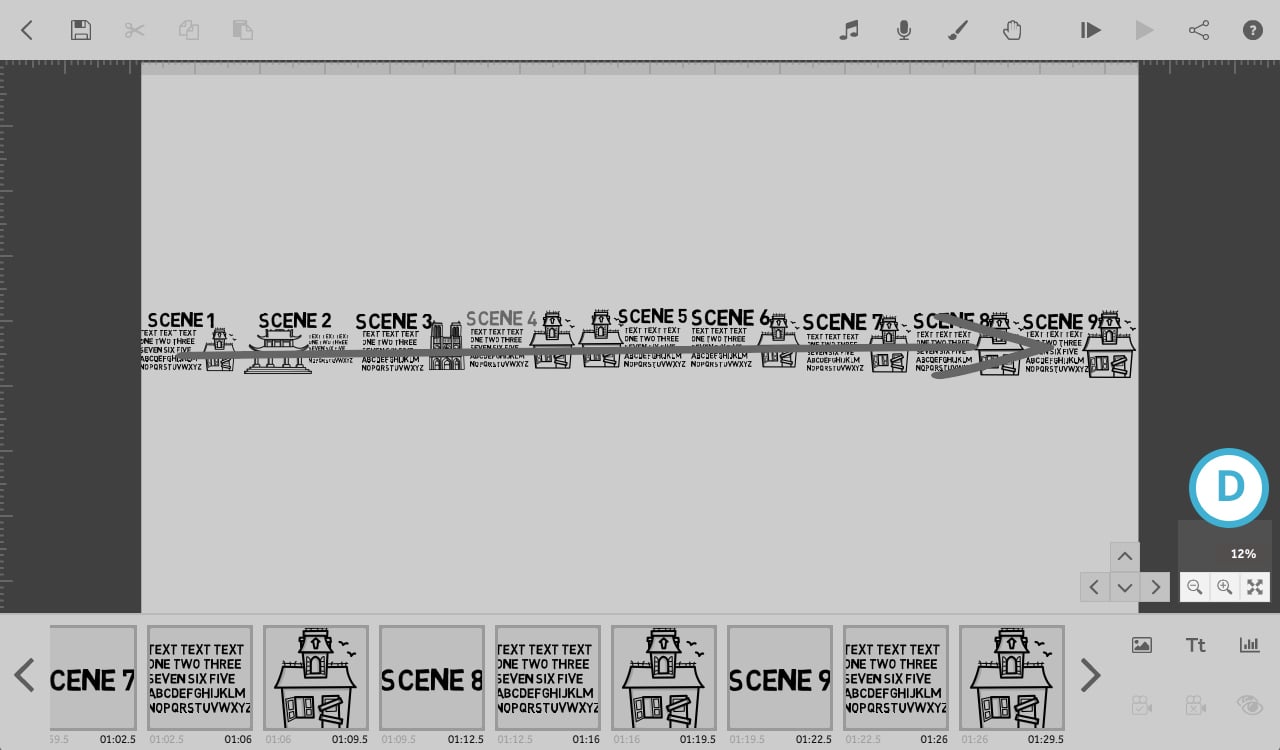
Below are some examples of scribe layouts that do not use the canvas space and camera view as efficiently. If you have already built your scribe in one of these styles, that is completely fine but it may be worth considering changing the layout when building your next project.
Here you can see that the camera needs to zoom out to 12% (D) to fit all the scenes into view, there is a lot of unused canvas space and the text is less readable.

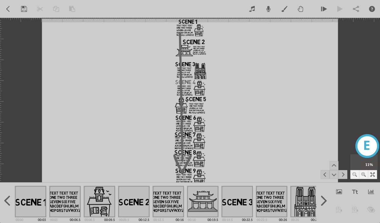
And here, where the scribe is laid out in a line from top to bottom the zoom level is at 11% (E). The camera has to zoom out slightly further because the scribe layout is going against the shape of the camera view - the camera view is wide and short but the scribe is laid out tall and thin.

Alternative layout
Once you know how to use the available canvas space and camera view most efficiently you can get creative with your layouts.
Top tip: You can use the .scribe files for the scribes that the screenshots were taken from. These can be opened in VideoScribe so you can see the settings that have been used for yourself. Feel free to use these as templates and edit how you want:
- vertical layout example.scribe (77.5 KB)
- horizontal layout example.scribe (77.5 KB)
- efficient scribe layout example.scribe (77.7 KB)