Text and image filters (VideoScribe Legacy)
There are a number different effects that you can add to your text and images to make them stand out using VideoScribe Legacy
Please note: VideoScribe Legacy is the older version of our software. We continue to support it, but we recommend switching to the latest version to enjoy the best features and performance.
Click here to read the article on Accessing VideoScribe (latest version).
You can enhance your text and images using Blur and Glow effects. You can adjust the Brightness, Contrast and Saturation of these effects. Underneath the options you can also turn on and customise the Drop shadow, Inner shadow and Bevel effects.
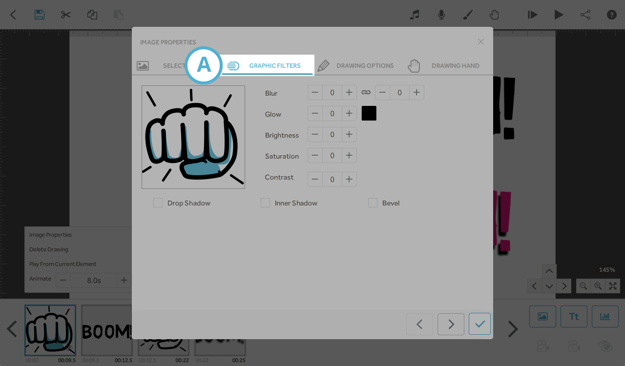
The effects can be found in the element properties by clicking the filters tab (A). It's best to use bright colours for the effects and start off with close to 100% opacity and 50 offset so you can see clearly the maximum limit then reduce as necessary.
Top tips: If you want other text elements to have the same effects and settings, or be the same size as existing text then it is a good idea to use the Copy and Paste buttons and then just amend the text in the pasted element as it will keep the settings from the original.
You can use blur and opacity to soften the effects.
There are 8 different text and image effect options that will be covered in this article. The effects are:
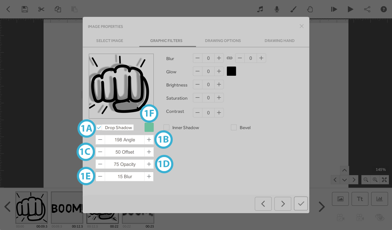
1. Drop Shadow - creates a shadow around text and images
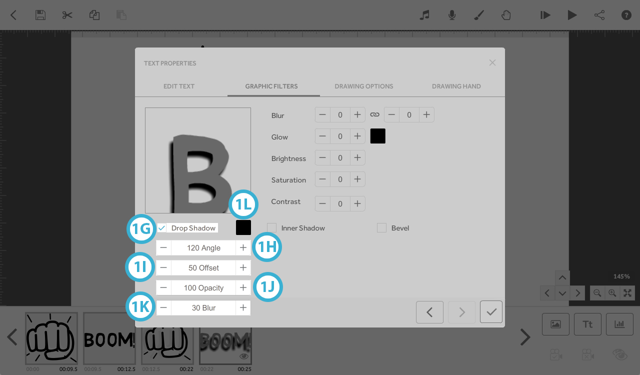
- Angle (in degrees); any value from 0˚ to 360˚ - the angle at which the shadow protrudes. E.g, 0˚ and 360˚ shadow falls to the right; 90˚ shadow falls below; 180˚ shadow falls to left; 270˚ shadow falls above.
- Offset; 0 to 50 - how far the shadow protrudes
- Opacity; 0 to 100%; 100%; solid shadow, 0%; invisible shadow (fully transparent).
- Blur; 0 to 30 - Sharpness/fuzziness of the edge of the shadow 0 - sharp; 30 - full blur (fuzzy)
- Colour; picker or hex code
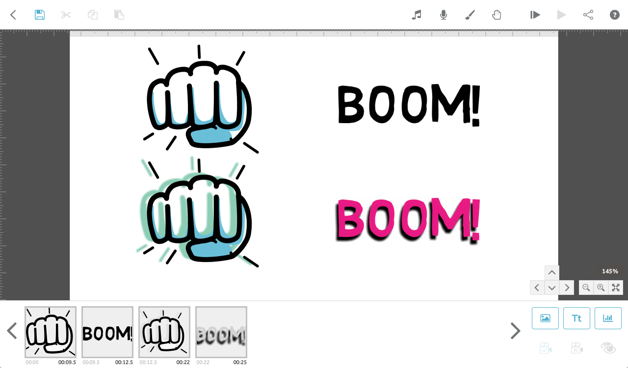
Image: Drop Shadow (1A); Angle: 198 (1B), Offset: 50 (1C), Opacity: 75% (1D), Blur: 15 (1E), Colour: 60bb9c (1F).
Text: Drop shadow (1G); Angle: 120 (1H), Offset: 50 (1I), Contrast: 100% (1J), Blur: 30 (1K), Colour: 0 (black) (1L).
2. Inner Shadow - creates a shadow within the lines of the text or image element (this is only visible if the text/image and inner shadow colours are different)
- Angle; any value from 0˚ to 360˚ - the angle at which shadow is recessed. E.g, 0˚ and 360˚ shadow falls to the right; 90˚ shadow falls below; 180˚ shadow falls to left; 270˚ shadow falls above.
- Offset; 0 to 50 - how far the shadow is recessed.
- Opacity; 0 to 100% - 100%; solid shadow, 0%; invisible shadow (fully transparent).
- Blur; 0 to 30 - Sharpness/fuzziness of the edge of the shadow 0 - sharp; 30 - full blur (fuzzy).
- Colour; picker or hex code.
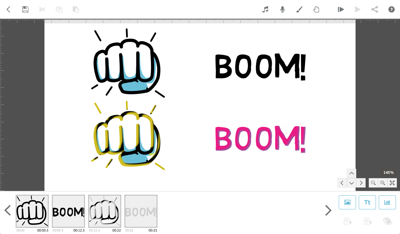
Text: Inner shadow (2A); Angle: 215 (2B), Offset: 30 (2C), Opacity: 50% (2D), Blur: 19 (2E), Colour: 507dbf (2F).
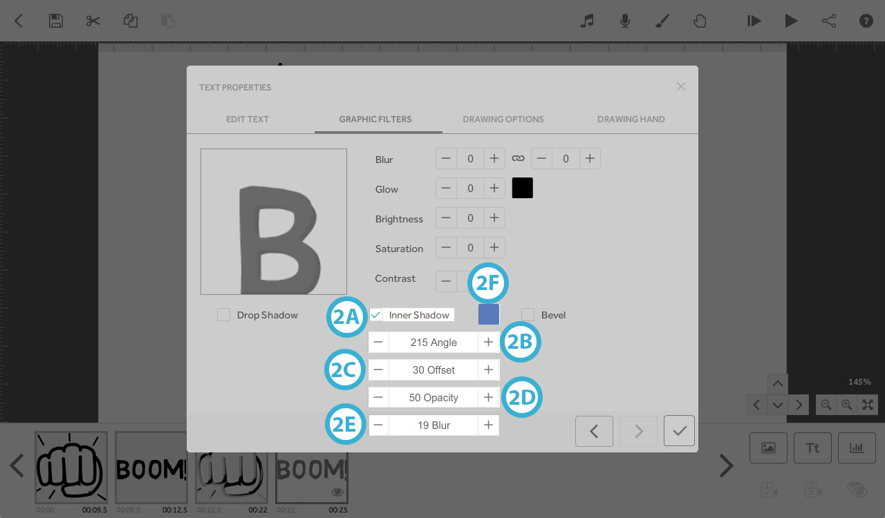
Image: Inner shadow (2G); Angle: 320 (2H), Offset: 38 (2I), Opacity: 84% (2J), Blur: 17 (2K), Colour: fede00 (2L).
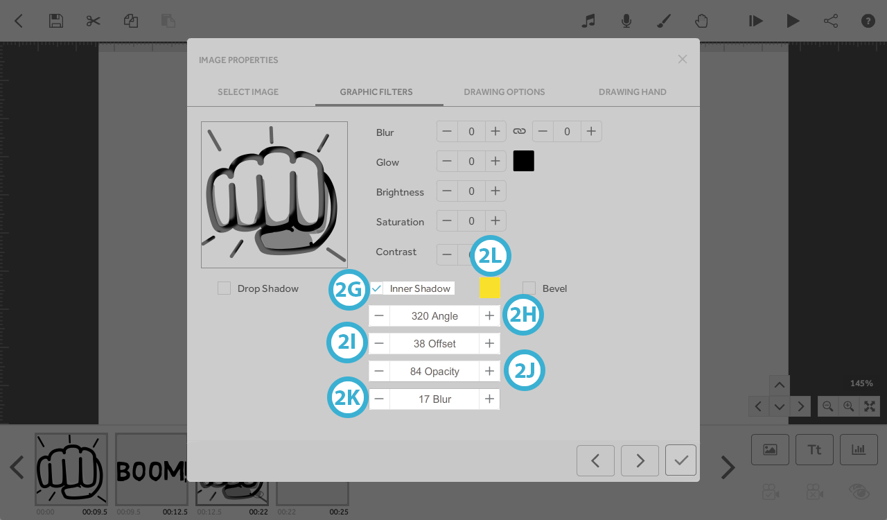
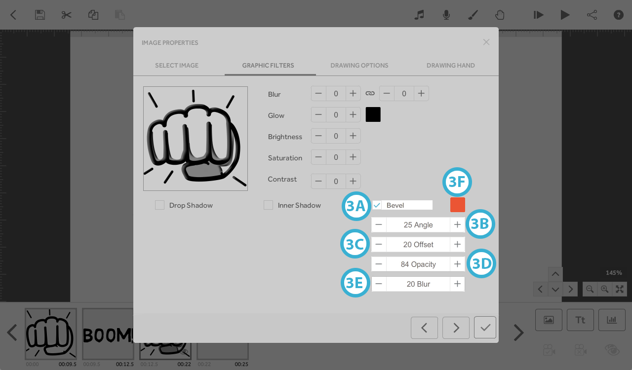
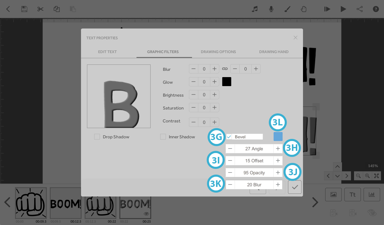
3. Bevel - creates the illusion of 3D text by adding a bevelled edge (this is only visible if the text/image and bevel colours are different)
- Angle; any value from 0˚ to 360˚. E.g; 0˚ and 360˚ - bevel appears on the left; 90˚ - bevel appears above; 180˚ - bevel appears right; 270˚ - bevel appears below.
- Offset; 0 to 50, - width of bevel - 1; thin, 50; thick bevel
- Opacity; 0 to 100%, Transparency of the bevelled edge (colour of text/image will change the colour of the bevel if transparency of the bevel is below 100%).
- Blur; 0 to 30 - Sharpness/fuzziness between the bevelled edge and text/image; 0 - sharp; 30 - full blur (fuzzy).
- Colour; picker or hex code
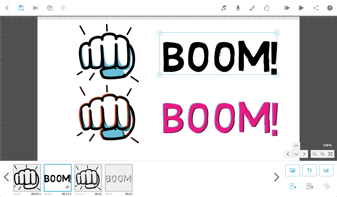
Image: Bevel (3A); Angle: 25 (3B), Offset: 20 (3C), Opacity: 84% (3D), Blur: 20 (3E), Colour: f15a29 (3F).
Text: Bevel (3G); Angle: 27 (3H), Offset: 15 (3I), Opacity: 95% (3J), Blur: 20 (3K), Colour: 59a7db (3L).
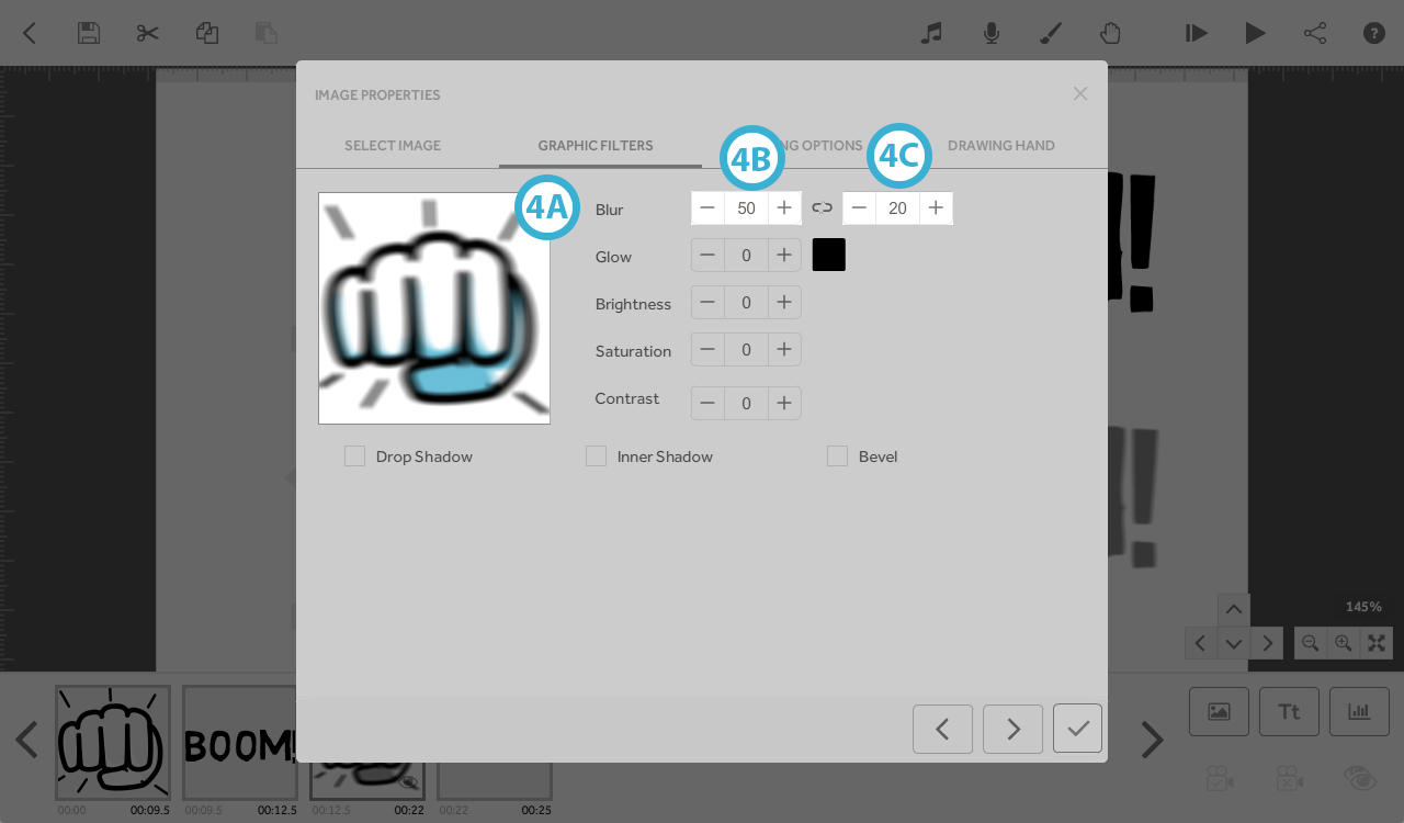
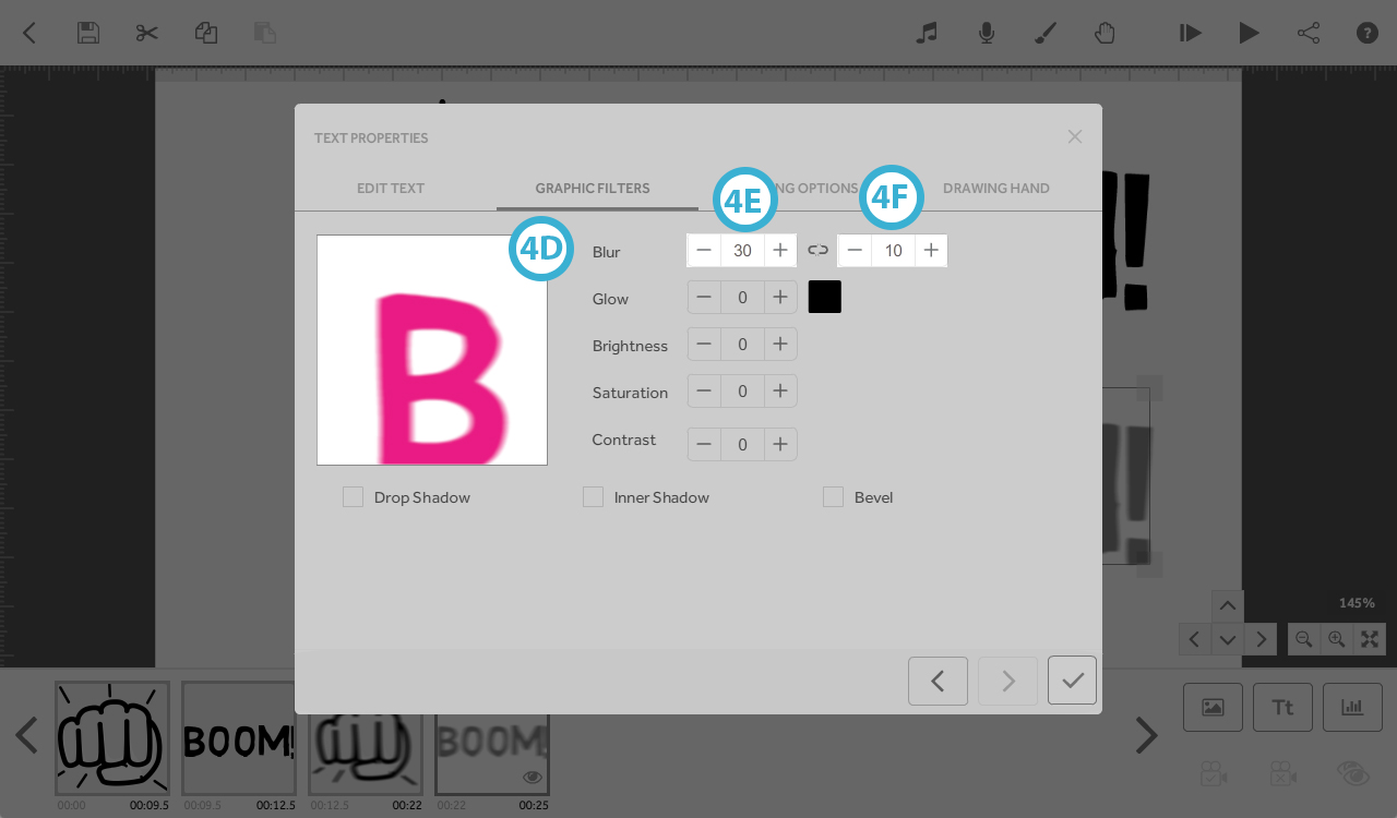
4. Blur - adds horizontal and vertical blur
- Left value - Horizontal blur; 0 to 50
- Right value - vertical blur; 0 to 50
- When the link is joined the 2 values will be the same
- When the link is broken the values can be adjusted independently

Image: Blur (4A); Horizontal Blur: 50 (4B), Vertical blur: 20 (4C).
Text: Blur (4D); Horizontal Blur: 30 (4E), Vertical blur: 10 (4F).
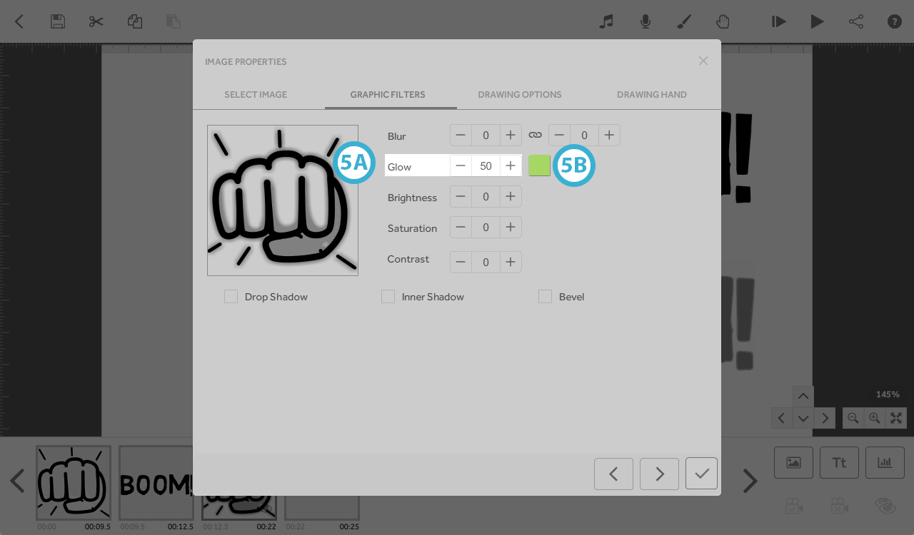
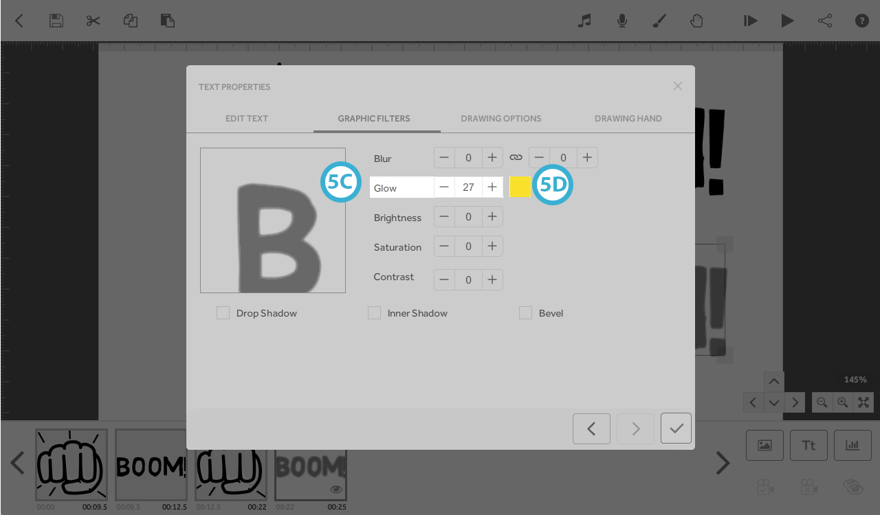
5. Glow - 0 to 50 - adds a coloured glow around the edges of the text/image
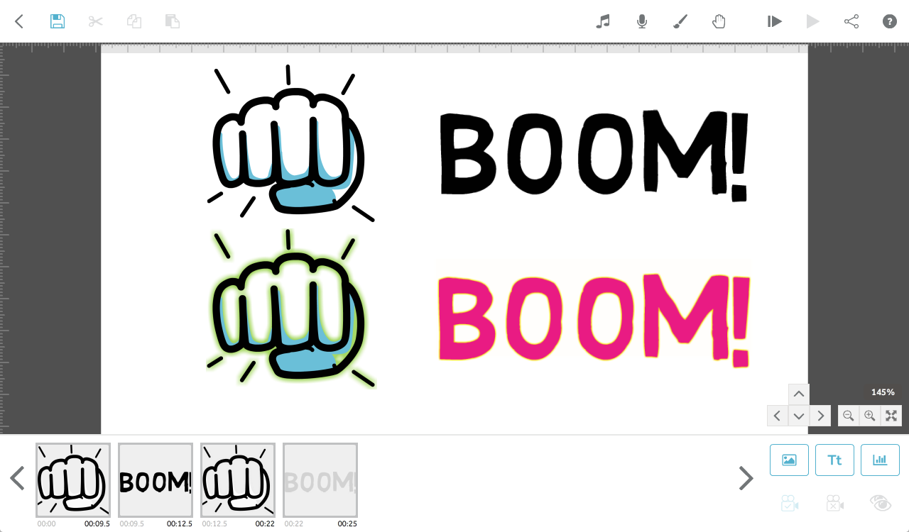
Image: Glow; 50 (5A), colour: #a7d35f (5B).
Text: Glow: 27 (5C); colour: #fede00 (5D).
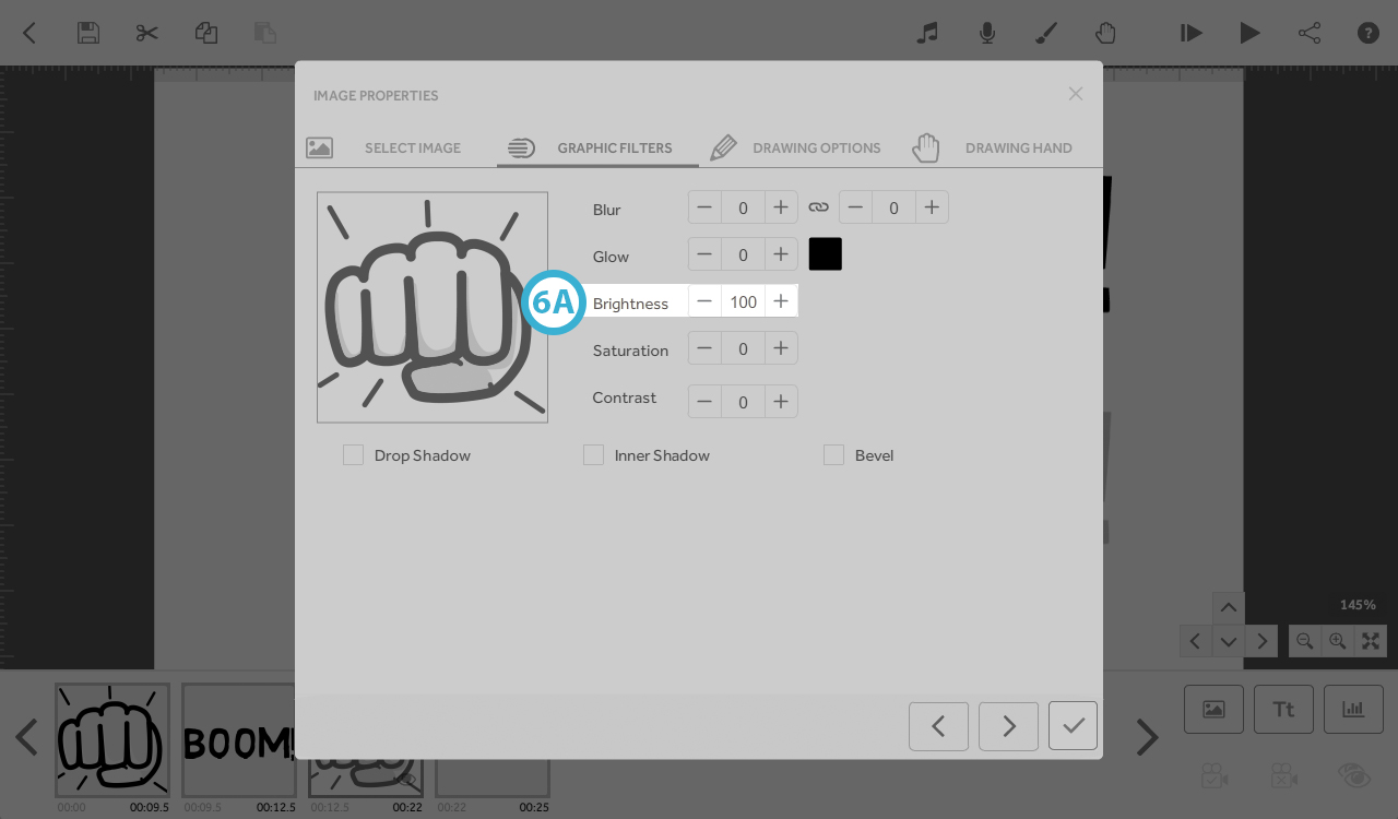
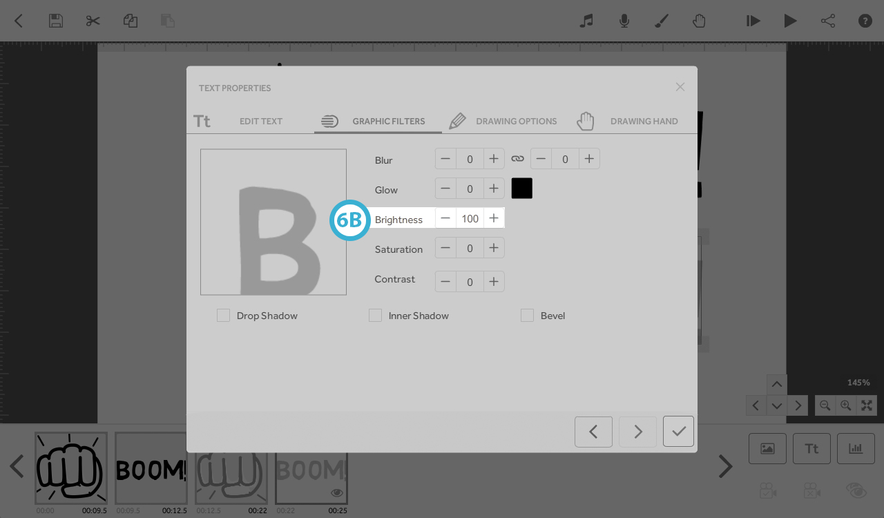
6. Brightness - 0 to 100 - affects the brightness of the text/image colour
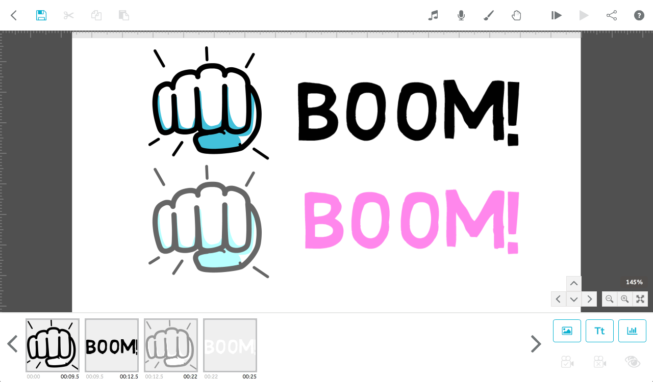
Image: Brightness: 100 (6A).
Text: Brightness: 100 (6B).
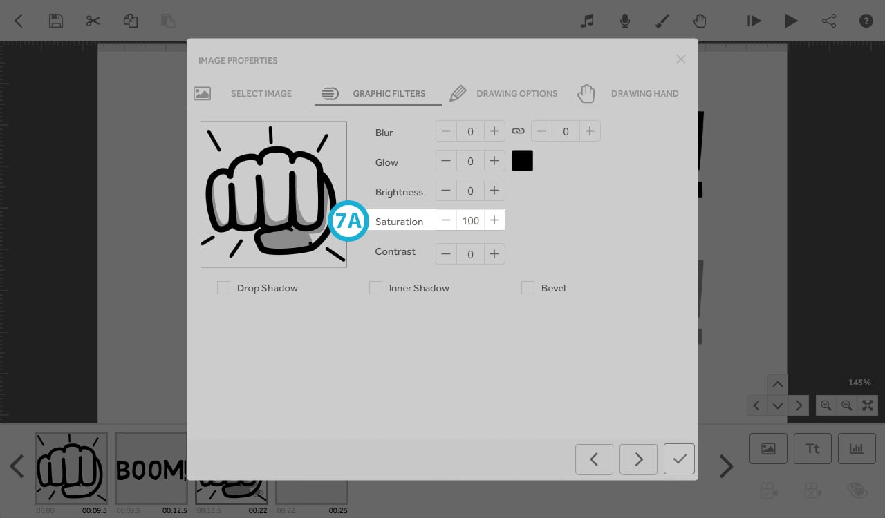
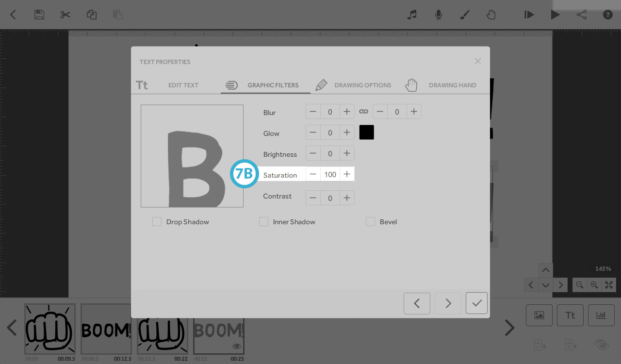
7. Saturation - 0 to 100 - affects the saturation of the text/image colour
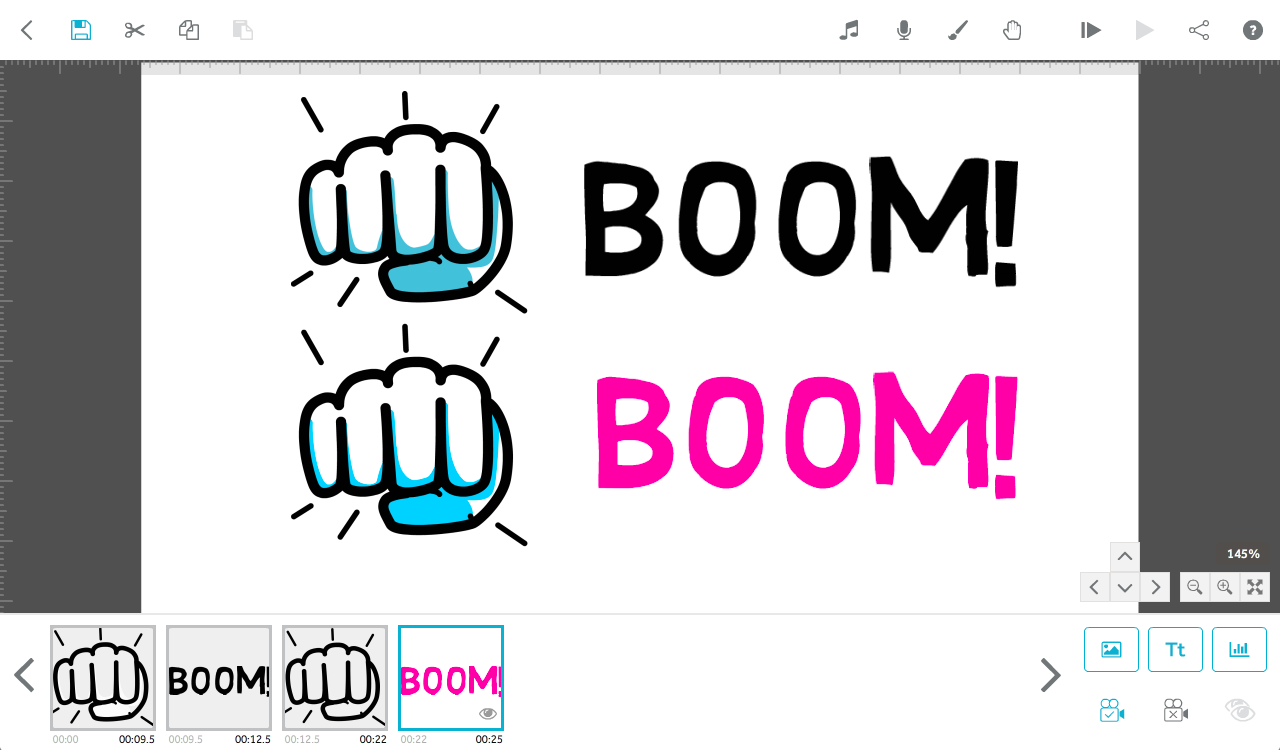
Image: Saturation: 100 (7A).
Text: Saturation: 100 (7B).
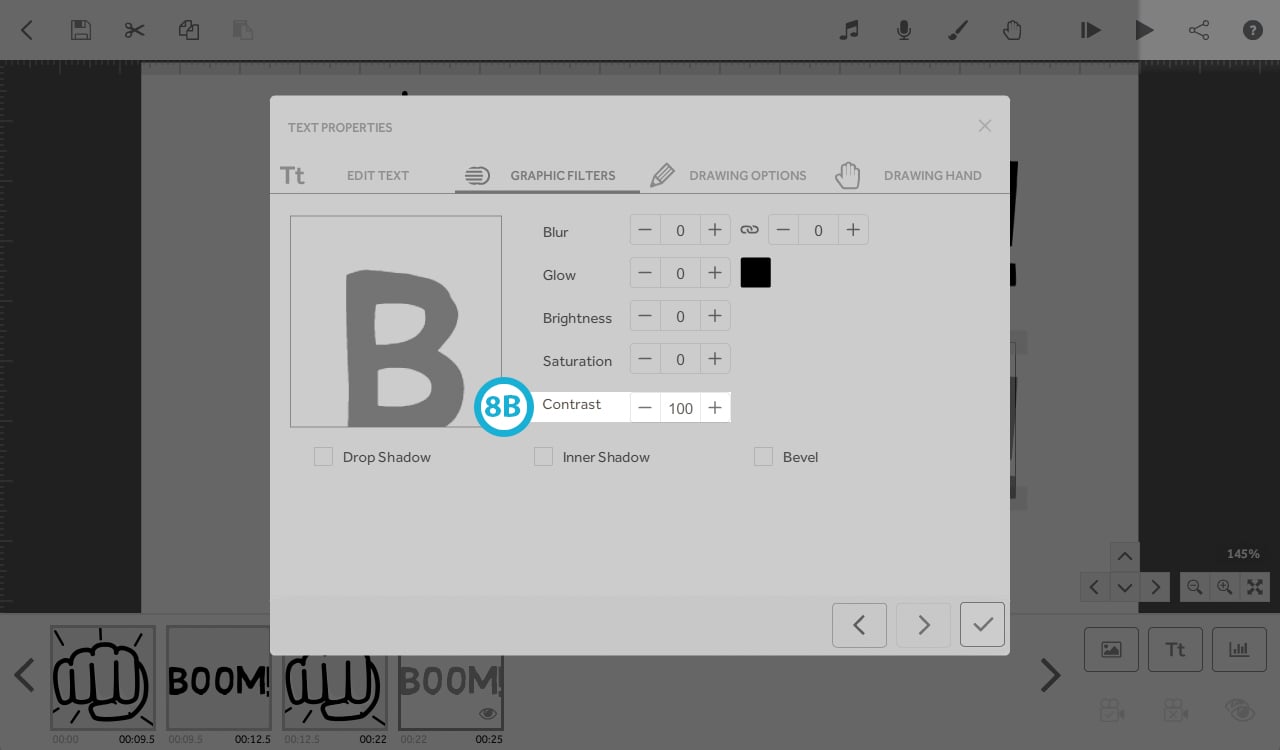
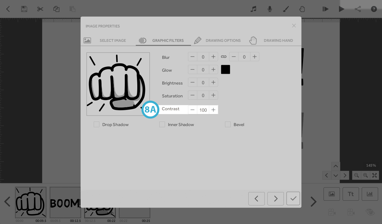
8. Contrast - 0 to 100 - affects the contrast of the text/image colour
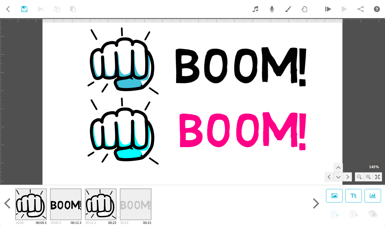
Image: Contrast: 100 (8A).
Text: Contrast: 100 (8B).
